
VISITOR FLEET
Visitor Fleet started out as a local group called CT-V: Connecticut Mothership that focused on recreating the most screen-accurate reproductions of costumes and props from the 80s science fiction television miniseries “V”.
As word spread and more people wanted to participate, “Visitor Fleet” was formed to include and unite V fans from all over the world.
Website
Services
- Logo Design
- Website Design & Maintenance (ongoing)
- Promotional Materials
LOGO DESIGN
Visitor Fleet’s originated from the CT-V: Connecticut Mothership which attended various comic/fan conventions dressed in the costumes and props they made. After finding such a welcoming response, they wanted to create a social media presence to connect with other fans of the show as well as other cosplayers and costumers.
The first logo was inspired by some signage seen in the miniseries that had an interesting “three-petaled” shield shape. The colors were a simple choice, keeping the basic red and black shown for the alien Visitors’ branding within the show. The recognizable glyph was incorporated as well as a suitable font with a sci-fi look.
The creators of the show invented their own alien alphabet for the fictional Visitors, and having additional space below, we thought we would use a fan-approved character key to say “CT-V” in the bottom portion.
This established a logo branding template that could be used for both Visitor Fleet as an “umbrella” organization and to represent other “Motherships” in other US states and other countries around the world.

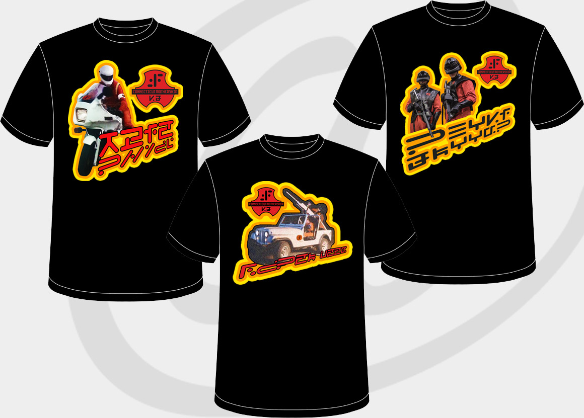
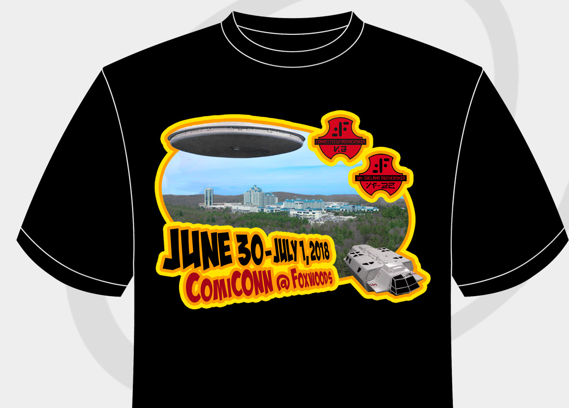
PROMOTIONAL MATERIALS
As Visitor Fleet grew into an international costuming community, its members wanted to be able to celebrate their local chapter as well as Visitor Fleet when they weren’t dressed up at a con.
Besides stickers and window clings of the basic logos they wanted apparel that would be exclusive to the group. The first concept was to give it an 80s t-shirt transfer look to show off the vehicles and the costumes. Again, the Visitor alphabet was used to spell out what was being shown pictorally (e.g. Laser Jeep, Biker Scout, Shocktrooper). The same concept was used for a limited-edition convention shirt where the Connecticut chapter exhibited their props including an actual Jeep and Bike refurbished to look like they came right out of the show and was joined by some UK members.