PORTARÉ DESIGN
Portaré Design came about as a side business for an architectural/interior designer who had been working for decades in professional architectural firms.
Portaré Design hadn’t really developed a branded look, despite being active for several years, so it was time to develop a logo to look more professional in order catch potential clients’ attention.
LOGO DESIGN
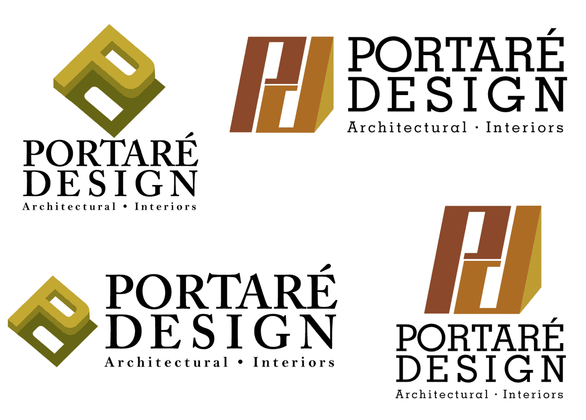
We wanted the logo to be clean and crisp like his design style and hint towards the architectural industry. The marketing materials currently being used warm greens and browns to reflect the firm’s focus on green building and creating organic spaces and we wanted to maintain that color scheme.
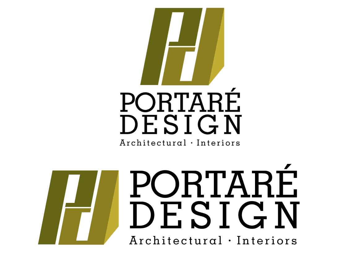
The first thing I noticed is how the letters “P” and the lowercase “d” had perfect symmetry and the potential to combine into a structural-looking graphic. A blocky, sans-serif font seemed the most appropriate to get that idea across and after experimenting with several fonts, two concepts were presented.
Ultimately, it was decided that the “leaning” concept in greens matched with a simple, blocky, serif font for the text most represented Portaré Designs’ vision.


