CRA INC
Connecticut Reading Association, Inc. came to me with a difficult-to-navigate website that only one person was able to update. They also had an annual conference that required mailings to invite and remind members to register as well as a sizable print conference brochure that they were producing at large cost. In addition, they had a journal that they wanted to make more attractive to readers.
Later on in 2020, they were ready to give their organization’s look an overhaul and their old, dated logo needed to be replaced, which in turn led to a second website redesign to maintain the consistency of their new branding strategy.
Website
Services
- Logo Design
- Website Redesign / Build
- Branding
- Brochure Design
- Print Advertising Collateral
- Event Swag
- Instructing Client in WP Bakery
LOGO DESIGN
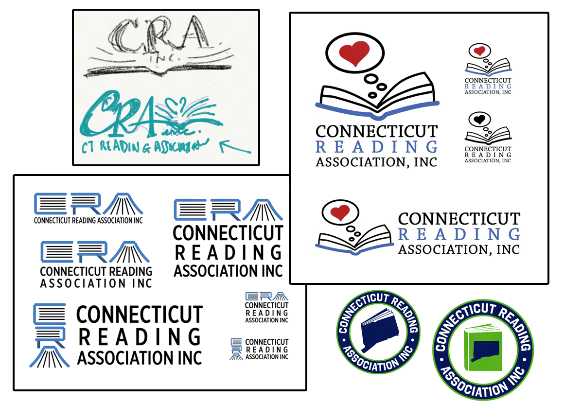
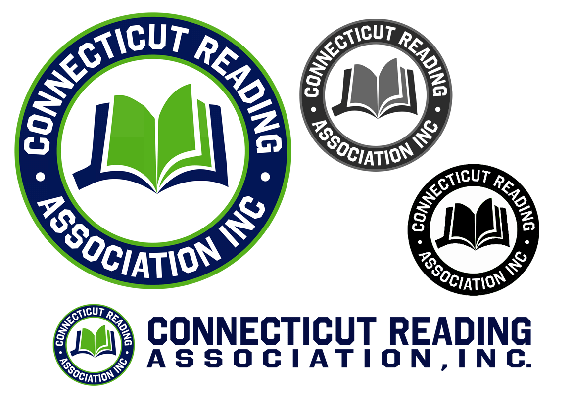
CRA had been using the same logo since they first formed and felt it no longer represented their modern focus on literacy. It also lacked the versatility to be used in different configurations such as letterhead versus social media versus merchandise.
After brainstorming with board members and trying a few different directions, we settled on an academic look. The new logo uses a collegiate-style font and structure, but also incorporates their mission of literacy and that they are Connecticut-based (as they are one of several chapters of an international organization).


EVENT BRANDING
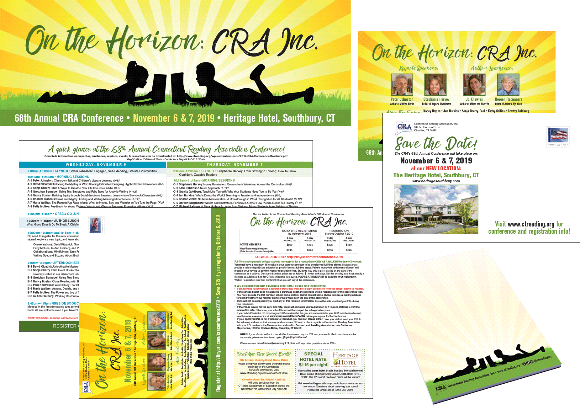
CRA, Inc.’s annual conference is their biggest event of the year. Each year there is a new theme, featured speakers, workshops and seminars for the course of a weekend. Branding the Conference as well as getting the word out there was always the priority.
Each year, I created a new, branded look to use throughout all of their advertising (print mail, e-mail, social media posts, and website) that reflected their current theme through a combination of stock images as well as my own typography and illustration.
That branding was further extended to any signage at the conference as well as to any fun swag items we gave away to every attendee like notepads.
BROCHURE DESIGN
When CRA, Inc. first came to me, they told me about their annual conference and how they would need help with their conference brochure. They had been printing the many-paged document at quite an expense – considering they needed to mail them to hundreds of potential attendees.
I suggested that an online PDF conference brochure would be a much better way. Not only would they save hundreds of dollars on printing and mailing costs, but it would be fully accessible and downloadable by all of their membership as well as potential members who wouldn’t be on their mailing list. In addition, the often frequent changes that occurred regarding speakers and sessions could be updated in a single virtual location, negating the need for email or mailing out corrections. Also, on the days of the conference, it would act as a quick guide for any information needed by attendees at the touch of a button or screen.
© 2005-2025 Alexander Design & Photography. All Rights Reserved.
